
Situation
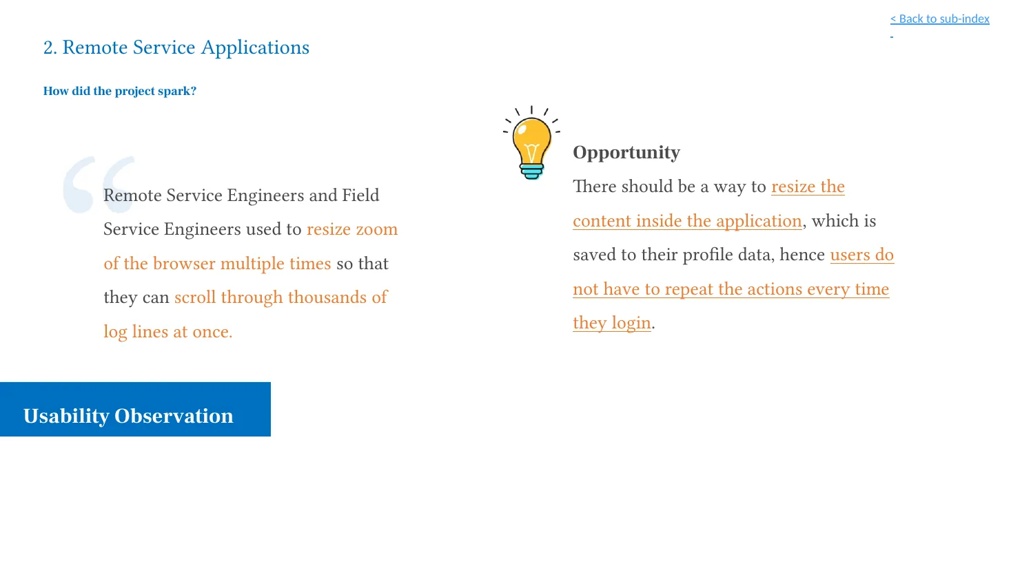
Remote and field service engineers needed to scan large volumes of technical log lines, and repeatedly changed browser zoom to fit more information on screen.
Case study / 04 · Shipped
A two-hour workshop turned a browser-zoom workaround into a reusable, developer-ready log-reading pattern that shipped two sprints later.
A two-hour developer workshop became a shipped log-reading framework two sprints later.
At a glance
Evidence to decision
Remote and field service engineers repeatedly changed browser zoom to scan dense technical logs, shrinking the whole application in the process.
The observed workaround showed a need for greater information density, while existing typography and interface controls established clear lower bounds and fixed-element guardrails.
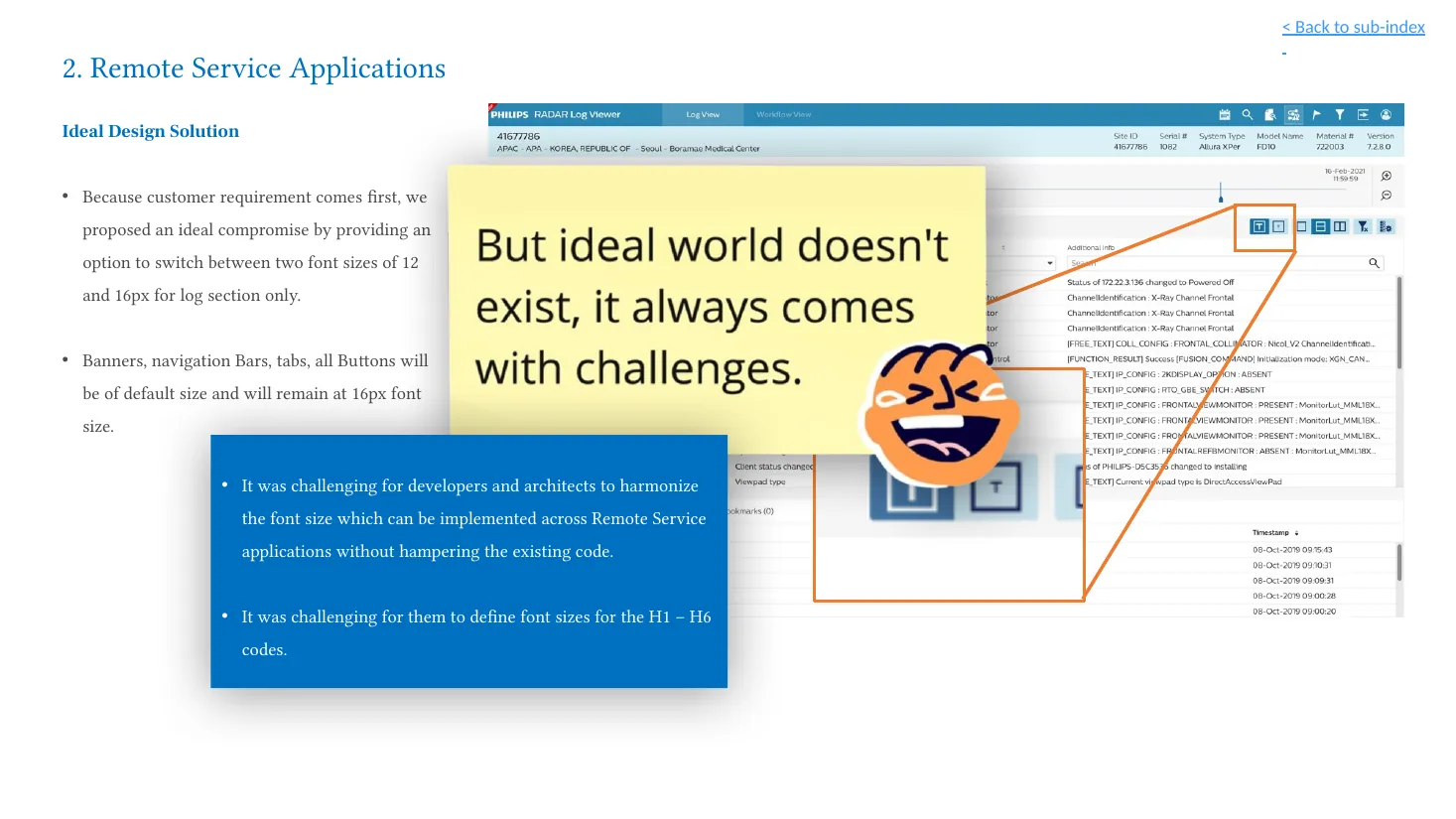
The density adjustment belonged in log-reading content, not in navigation, banners, tabs, or buttons.
Define a two-size log mode and make its font hierarchy, row heights, spacing, and unchanged interface elements explicit with developers.
A developer-facing typography framework and a scoped 12px and 16px log-reading option.
The option and framework shipped after two sprints; adoption and measured performance effects were not supplied.
Remote and field service engineers needed to scan large volumes of technical log lines, and repeatedly changed browser zoom to fit more information on screen.
Create a readable small-text option for log sections while protecting the size and clarity of shared navigation and controls.
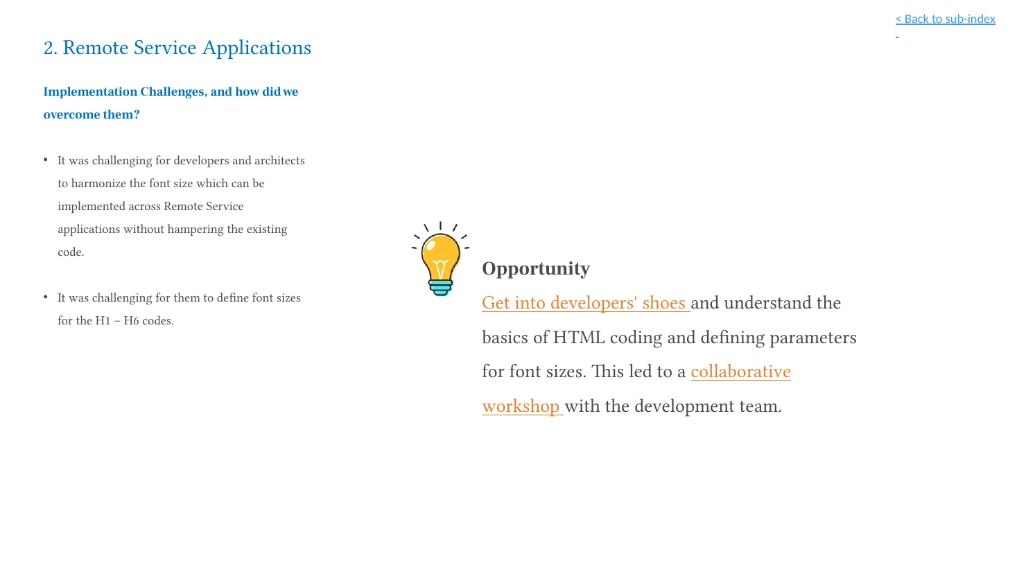
Facilitated a two-hour whiteboarding workshop with developers to define an implementable font-size, weight, and hierarchy framework.
The 12px and 16px log-reading option and its supporting framework were deployed to users after two sprints.
This project began with an observed workaround: remote and field service engineers repeatedly changed browser zoom so they could scan more log lines at once. That workaround helped people fit more information on screen, but it applied to the whole page rather than to the high-density content that needed it.
I facilitated a focused workshop with developers to turn that observation into a practical, reusable font framework. The result was a two-size reading mode for log sections, paired with clear implementation boundaries for the rest of the interface.
Dense logs require different reading conditions from navigation, banners, tabs, and buttons. The challenge was to give engineers more compact log content without shrinking shared controls or creating inconsistent typography across related applications.
As UX Designer & Workshop Facilitator, I:
The work served remote and field service engineers reviewing large volumes of technical log information in remote-monitoring applications. The relevant task was scanning and interpreting log content efficiently—not changing the appearance of the entire application.
The starting point was an observed behaviour rather than a request for a large redesign. Engineers were already adapting the interface with browser zoom. The opportunity was to move that adaptation into the product and make it purposeful.
The proposal preserved standard-size interface controls and introduced an explicit choice only where density mattered: the log reader. This made the trade-off visible, constrained, and straightforward to explain.
The workshop objective was to determine base fonts, weights, and their multiples for default and small font-size modes. Rather than creating a complex new solution, the session focused on making the typography math explicit enough for developers to implement consistently.
The following values are transcribed from the supplied workshop grid. The original Factor column is retained as documented; it is not recalculated or interpreted here.
| Tag | Default | Factor | Small |
|---|---|---|---|
| Base (a, label, table content etc) | 16px | 1 | 12px |
| H1 | 20px Bold | 1.25 | 16px Bold |
| H2 | 20px Bold | 1.25 | 16px Bold |
| H3 | 20px Normal | 1.25 | 16px Normal |
| H4 | 18px Bold | 1.125 | 14px Bold |
| H5 | 18px Medium | 1.125 | 14px Medium |
| H6 | 16px Bold | 1 | 12px Bold |
| Table headers | 14px Normal | 0.875 | 12px Normal |
| Tooltips/Error | 12px Normal | 0.75 | 12px Normal |
| Tooltips | 12px Bold | 0.75 | 12px Normal |
| Table row height | 32px | 2 | 24px |
| Component padding (top/bottom) | 12px | — | 8px |
| Space between content | 12px | — | 12px |
The 12px and 16px log-reading option, supported by the framework above, was deployed to users after two sprints. This case study does not claim profile persistence, adoption figures, or measured performance effects because those were not supplied as evidence.
The project delivered two connected outputs:
The practical outcome was a focused reading control and a clearer implementation conversation—not a full-interface rescaling exercise.
This work reinforced that some technical problems are best advanced through design leadership rather than a larger feature set. Whiteboarding with developers, making space for informal shared moments (including some chocolates), and building trusted stakeholder relationships helped the group move from a usability observation to a workable framework. Strong relationships made it easier to surface constraints early and solve the right-sized problem together.
Case-study source: user-supplied 2022 project deck. Screens shown in this case study retain legacy visual branding from that source and are intended to be replaced when updated assets are available.